
…or how little is too little. Quite a subjective topic, and of course there are no laws in the arts while “rules” are merely guides. Having done a lot of nature photography in the past seven-odd years, I generally find that my first impression when proofing my own photos is what appeals most to me aesthetically even in the long run. Do viewers and peers share my visual preferences? I’m not sure. Please do feel free to tell me how you feel about these photos in my comments section.
Today’s subject material ended up being the common Pokeweed plant. I haven’t done many abstract closeup photos before, so I tried some different camera motions to try to coincide with the shape of the berries and stem. All photos taken with the Tamron SP 90mm VC F/2.8 1:1 Macro Lens and the Canon EOS 60D, handheld.
#1 – My finalized photo:

Optimized image with intentional camera movement, ICM.
Settings for above photo: 1/5th F/11 ISO 100. A slight circular motion of the camera was made.
#2 A split screen comparison of the SOOC shot versus my end product:

Lower left is the straight out of camera shot, upper right is what I deemed to have a good amount of contrast for web viewing.
#3 An outtake, not enough motion makes this look sloppy to me
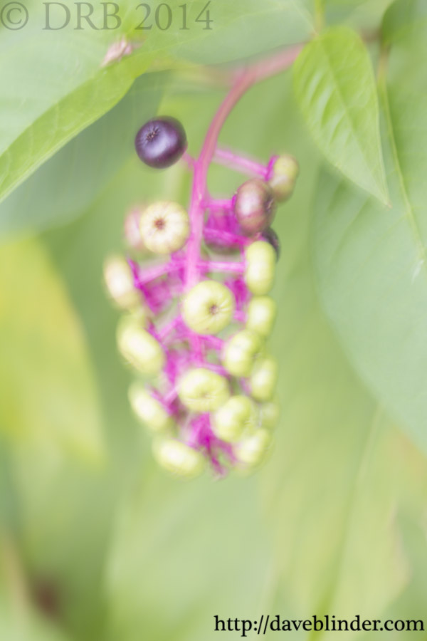
A slow hand movement has rendered a fair amount of sharpness on the subject but still left faint signs of blur.
Above photo settings: 1/5th F/11 ISO 100. Camera was moved in a slow fashion.
#4 Another outtake. To me, the subject is unidentifiable and this photo lacks a sense of order:
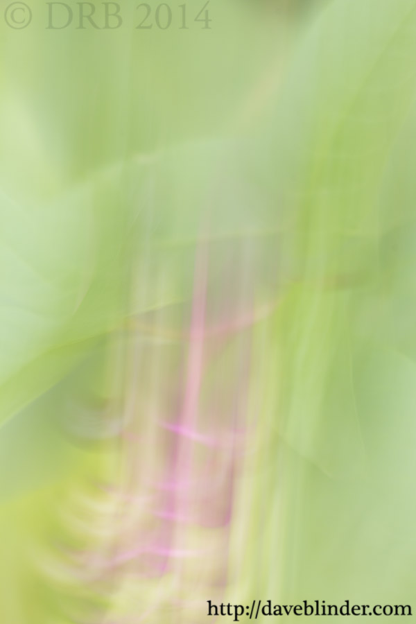
Created with a very fast downward motion of the camera as the shutter was closing.
Above photo settings: 1/5th F/11 ISO 100. Camera was moved in a very quick fashion.
Which do you think looks best?

I like the first one best. Too little movement can look like camera shake, too much can render the subject unrecognizable (but sometimes that can be cool, too).
LikeLike
Great minds think alike Karen!
LikeLike